Uncovering The Significance Of The Panera Logo
If you’ve enjoyed the tasty offerings from Panera Bread, you might not have noticed the fascinating changes in its logo over the years. The brand, which began in 1987 as The St. Louis Bread Company thanks to Ken and Linda Rosenthal, has a logo evolution that’s as notable as its renowned bakery items.
In 1997, the company rebranded to Panera Bread, a name we’re all familiar with today. Let’s explore the details behind its logo’s evolution, especially the hidden meanings in the current design.
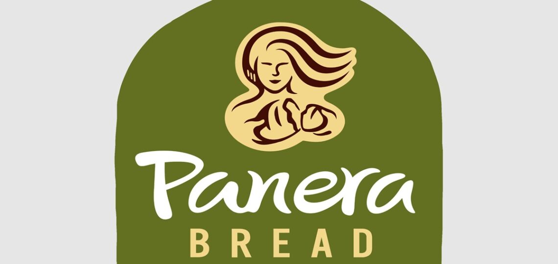
The initial Panera logo featured a comforting image of a woman gently holding a loaf of bread. Over time, Panera’s logo has seen five different versions, but one constant has been the depiction of the woman with the loaf.

In the most recent logo, the woman faces the viewer, offering a friendly and welcoming vibe, as if inviting you to share a meal. A notable feature in this design is the green arch in the background. What’s the significance of this arch? It’s more than just a design element; it’s meant to evoke the mouth of an oven. This subtle detail gives a glimpse into the oven where the delicious bread is baked.
Furthermore, the green arch represents Panera’s dedication to using natural ingredients. The color green reflects the freshness and quality of the ingredients that go into their dishes.
So next time you’re enjoying a meal from Panera, take a moment to appreciate the story behind their logo. It’s not just an image of a woman and a loaf of bread but a symbol of warmth, transformation, and a commitment to quality that defines every Panera experience.